Making a multi-chain wallet look like something you can actually trust
Designed and validated against ~30 usability sessions; the rebrand is complete and development is underway, coming soon. No adoption numbers claimed yet. A trust problem any commerce or fintech team faces: the product worked, but it didn't look like something people would trust with real money, and in testing they said exactly that, unprompted. The setting is a multi-chain wallet; the work is brand and UI built to earn trust at the highest-stakes moments (connect and confirm), grounded in ~30 usability sessions, plus an AI-generated identity system that gives every account its own recognizable avatar instead of a blank string.
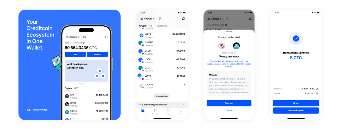
PenguinWallet's redesigned brand and UI, applied across the same feature set the old app already shipped. In development, coming soon
Problem
The wallet worked: multi-chain balances, swaps, custom gas fees, NFTs, dApp connections. But its dark, coin-heavy visual language looked like every other wallet on the market, and when we asked people directly, they said so: not trusted, looked old, no different from anything else.
Solution
A full brand and UI rebrand: a warmer, more trustworthy tone, illustrated characters and icons instead of stock coin art, and a wallet-identity system that turns a blank hex address into a unique, friendly avatar.
Practice
Ran usability sessions with about 30 people, gave them real tasks, and watched where trust actually broke down, not just what they said about the color palette.
Role
- Brand and UI redesign for an existing multi-chain wallet
- Usability research design and synthesis
- Built the AI-generated wallet-identity system, reused from an earlier project
- Led design, working with a team
Tools
- Figma, design and system source of truth
- Claude Code, for the deterministic wallet-identity generator
Process
- Research
- The Insight
- The System
- Where This Scales
- Impact & Retrospect
1.
Research
The app worked. What we needed to find out was why nobody trusted it.
1.1 A Working Wallet, Wearing the Wrong Face
Credit Wallet already did the job: multi-chain balances, customizable gas fees, mainnets and testnets, NFT viewing, cloud wallet import. None of that was the problem. The problem was everything around it, dark backgrounds, stock coin and token art, a name and mark that told you nothing about who made it or why you should trust them with your keys.
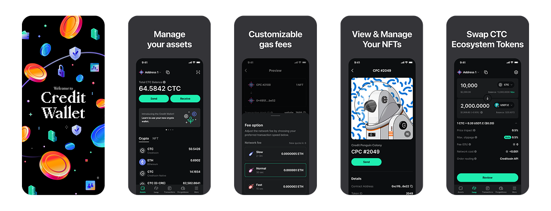
Credit Wallet's original marketing set: real multi-chain functionality, generic dark crypto styling that could belong to almost any wallet.
1.2 What ~30 Sessions Actually Surfaced
We ran usability sessions with about 30 people, combined with feedback pulled from our Discord community, gave participants real missions inside the app, and watched what they did rather than only asking what they thought.
What came back, session after session
- The same reactions, unprompted: "not trusted," "feels like an old app," "not sure what to do here, nothing to do," "no different from any other wallet."
- Given a mission to reach the event screen, most participants failed to get there.
- The team had no in-app channel to reach users directly, no notices, so they'd been asking people for private emails, inside a decentralized wallet. Nobody on the team had clocked how badly that undercut the product's own premise until we watched a participant hesitate over it.
Key findings
- Like a blind date: lose visual trust in the first moment, and no explanation of security or features wins it back, the wallet simply reads as unsafe.
- Users failing to reach the event screen meant the business's marketing strategy never reached them, a bigger problem than navigation: a breakdown in communication.
- The private-email workaround was a symptom of a missing communication channel, not a one-off mistake, and it's the kind of gap that's invisible until you watch a real user run into it.
2.
The Insight
In crypto, the interface is the one security feature people can actually judge
Nobody in our sessions could audit a smart contract or verify a seed phrase's entropy. What they could judge, instantly and unconsciously, was polish. Credit Wallet's dark, coin-heavy visual language was the category default, which meant it read as generic, indistinguishable from lower-trust competitors, before anyone ever got to the parts that actually kept their assets safe. If the interface is the only security signal most people can evaluate, it has to be designed like one.
The private-email finding pointed at something bigger than a UI gap. A decentralized wallet asking users for centralized personal contact information undercuts its own value proposition, and it only existed because there was no better option built into the product. Rebuilding trust meant fixing what people saw first, and flagging what still needed a real fix underneath.
3.
The System
A new visual language, a friendlier brand, and an identity system that gives every wallet address a face.
3.1 Before/After: A New Visual Language
Same feature set, rebuilt tone. The dark, generic crypto aesthetic gave way to a lighter, illustrated, distinctly branded one, PenguinWallet, named and designed to feel like a product a team actually stands behind rather than an anonymous coin app.
Before: Credit Wallet
Same product, same five chains, a visual language built to be trusted rather than merely functional.
3.2 Illustrated, Not Generic
The new mark leans on a penguin character already familiar to users: Credit Penguin Colony, an NFT collection that lived inside the wallet long before the rebrand. Building the new brand around it gave PenguinWallet a visual anchor people already recognized, instead of introducing one more unfamiliar mascot into an already crowded category.
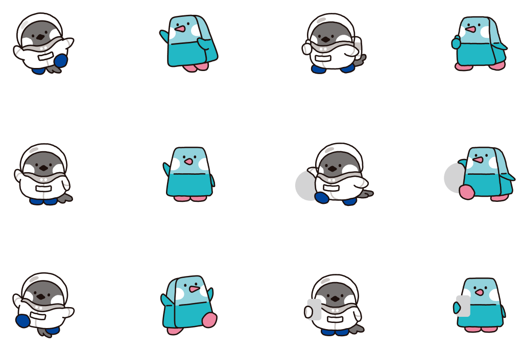
3.3 A Unique, Illustrated Identity for Every Wallet Concept, with a working PoC
A wallet address is a meaningless string of hex to almost everyone who looks at it. I built a generator, reused here from an earlier project, that deterministically maps any wallet address across five chains (Ethereum/EVM, Aptos, Sui, Solana, Bitcoin) to a unique illustrated character: split type, palette, character pose, and badge all derived by XOR-folding the address itself into nine seeds. Same address in, same friendly identity out, every time, with roughly 39.5 million possible combinations.
It's a small piece of the redesign, but it does real work: instead of a cold hex string standing in for "this is you," people get a character they can recognize at a glance, one more small proof that the team building this wallet cared enough to make even the boring parts feel considered.
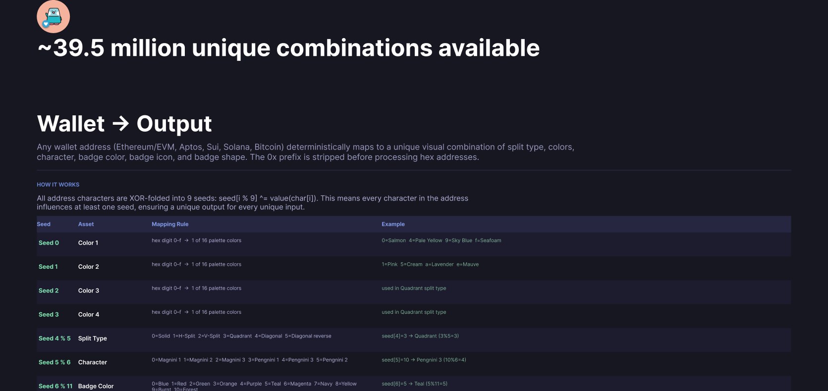
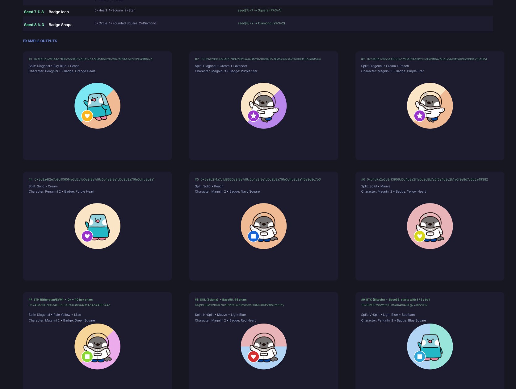
Nine real outputs from nine real addresses across three chains, same generator, same deterministic rules, never the same result twice.
3.4 Same System, Real Screens
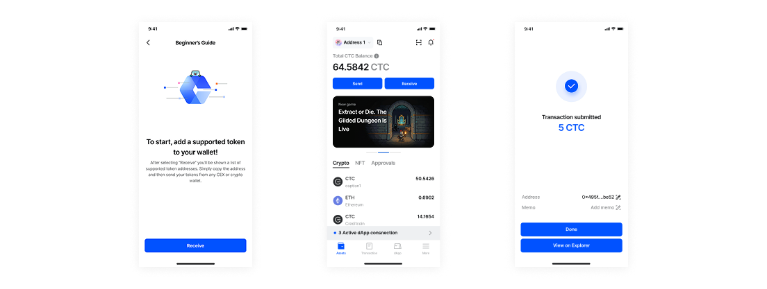
The rebrand had to hold up in the screens that actually carry security weight, not just on a marketing page: the balance screen people check daily, the token and approvals list, and the confirmation that a transaction actually went through. That last one is where a generic-looking wallet loses people fastest, so it's where the new visual language had to work hardest.
4.
Where This Scales Roadmap, not shipped
A visual rebrand fixed what people see first. It didn't fix everything research surfaced.
The private-email workaround is still open. It's not a design problem so much as a missing feature: an in-app notice and communication channel that lets the team reach users without asking for anything outside the wallet itself. That's next, not because it's glamorous, but because a decentralized product asking for centralized personal data is the kind of inconsistency that erodes exactly the trust this whole rebrand was built to earn. The identity-generator system is also built to extend past wallet addresses, the same deterministic approach could give a face to any object in the app that's currently just an ID.
5.
Impact & Retrospect
Reported honestly: designed and validated against real research; development is underway, but it is not yet in front of real users.
Every decision in this rebrand traces back to something a real participant said or did, not a hunch about what "modern crypto" should look like: the trustable tone answers "not trusted, looked old," the illustrated identity system answers "no different from any other wallet," and the flagged communication gap answers the private-email workaround nobody had questioned until we watched someone hesitate over it. The full redesign hasn't shipped yet, so there's no adoption number to report, only the research it's built on and the specific complaints it was built to resolve.
What I learned
- In categories built on trust, visual polish isn't cosmetic, it's the layer most users actually evaluate before anything else. Treat it accordingly.
- Watch where people fail, not just what they say about the color scheme. The event-screen task failures were the same trust problem showing up behaviorally.
- Workarounds hide structural gaps. If a team practice feels off-brand, like asking for private emails inside a decentralized wallet, it's worth asking why that workaround exists instead of just accepting it as how things are done.
The goal was never a friendlier mascot. It was a wallet whose interface finally matched the trust it was asking people to place in it.