Making a beginner's first fifteen minutes in crypto feel calm, clear, and safe
Pilot-tested: 5 of 6 first-time users finished the core task unaided; stakeholders tested working prototypes in week 2. Wrong input loses real money, and make it feel safe in the first fifteen minutes. The setting is an exchange launched Nigeria-first; the design work is first-run trust and onboarding. I drove the early decisions myself, gathering feedback and prototyping along the way: research synthesis, first-pass graphic assets, and quick wireframes built to A/B test internally. Once the direction was set, I led a team of designers who built out the rest of the product in Figma.
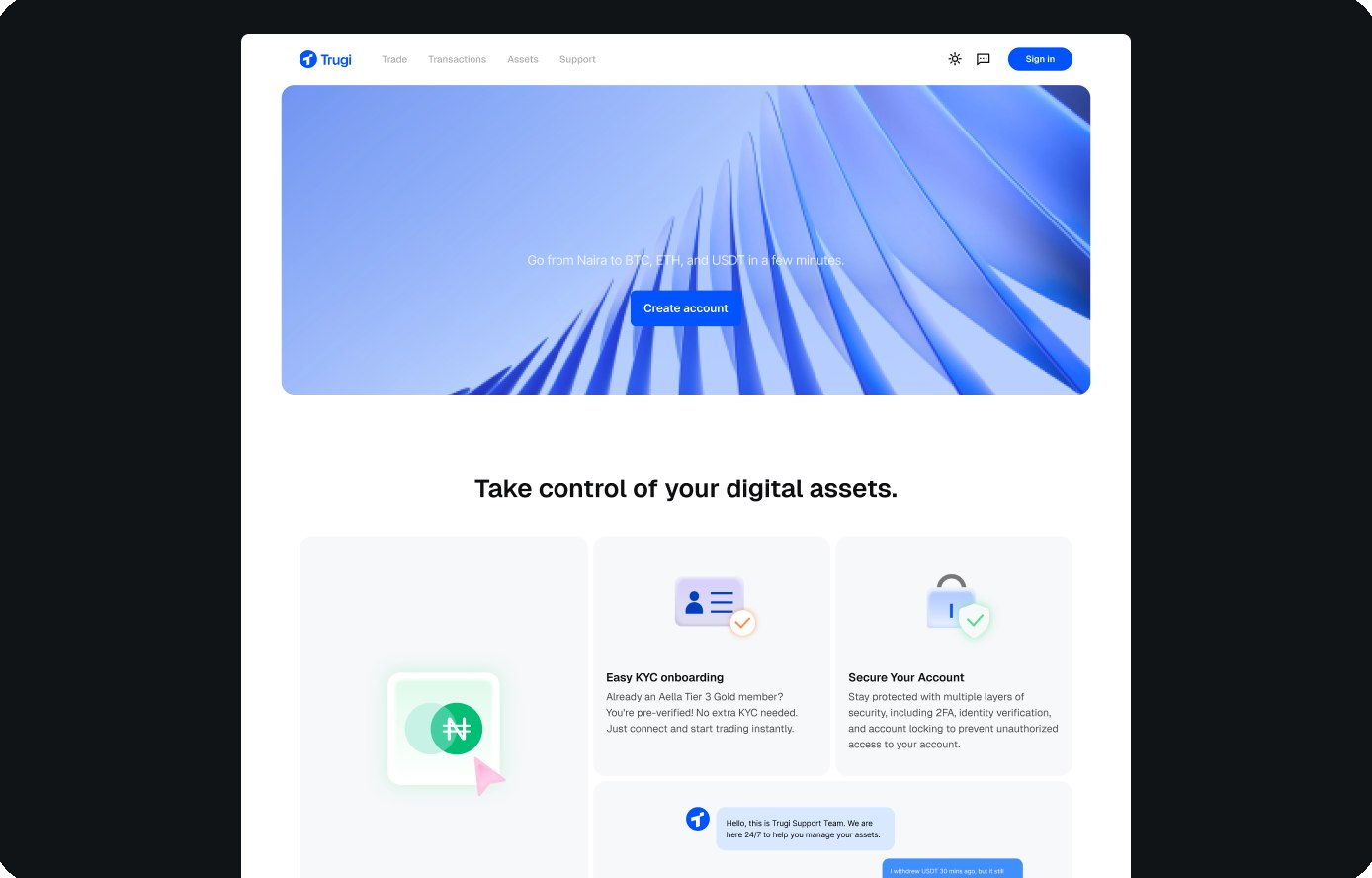
(Homepage shown cropped to the fold. Full page continues below.)
Problem
Most crypto exchanges are built for experts: walls of charts, unfamiliar terms, and no obvious place to start. For a beginner, that's enough to close the tab. Every beginner who bounces is a user lost to a competitor.
Solution
Show one clear step at a time, in a calm, transparent interface that hides nothing. Keep the amount readable at any size, and let a first trade feel like planting something, not gambling. The one-step principle came from research and held up in testing: five of six first-timers finished their trade unaided.
Practice
I treated the workflow as a design problem too: AI handled research synthesis, graphic-asset drafts, and quick decision wires, and I ran the A/B calls myself. Once the direction was set, a design team I led built out the rest in Figma. Stakeholders tested working prototypes by week two instead of annotating static mocks.
Role
- Led end-to-end design from zero to launch, including product strategy and narrative
- Built the modular design system engineering ships from directly, so handoff is the system, not redlines
- Prototyped core flows as working code with Claude Code, bridging design intent and engineering feasibility; stakeholders tested real behavior, not hypotheticals
- Drove early research and concept decisions personally, using AI for synthesis, graphic-asset drafts, and quick wireframes built to A/B test internally
- Led the design team that built out the rest of the product in Figma once the direction was set
Tools
- Figma, design and system source of truth
- Claude Code, working prototypes and documentation
- AI-assisted research synthesis and asset generation
Process
- Research
- The Insight
- The System
- The AI-Native Practice
- Impact & Retrospect
1.
Research
Understanding why beginners bounce off every exchange they try, and where Trugi could sit differently in the market.
1.1 Competitive Landscape
Established exchanges like Binance and Coinbase optimize for power users who already understand order types, spreads, and portfolio management. They solve trust through custody and verification, but a first-timer still has to learn the vocabulary before they can act. Trugi's edge: an exchange designed specifically around a beginner's first fifteen minutes, recognizing KYC a user already completed on a partner platform and clearing away the jargon everywhere else. This read wasn't a hunch: it came from the competitor teardowns clustered in the synthesis described in 1.3, verified against the products themselves.
1.2 Why Trugi Exists
Most exchanges throw everything at you at once. Trugi shows one clear step at a time.
Typical exchange charts, jargon, a dozen choices at once
Trugi one clear step, nothing hidden
1.3 How the Research Ran
Trugi launched in Nigeria first, syncing directly with local bank accounts through a banking partnership. Our team wasn't there: direct interviews and field research weren't an option for the first release. That constraint is exactly where AI earned its place. I used it to cluster Nigerian community threads, app reviews, and competitor teardowns into candidate pain themes in hours instead of days. And because we couldn't validate face to face, verification got stricter, not looser: before a theme could become a finding, I traced it back to the original threads and reviews it came from, and anything I couldn't confirm at the source was dropped.
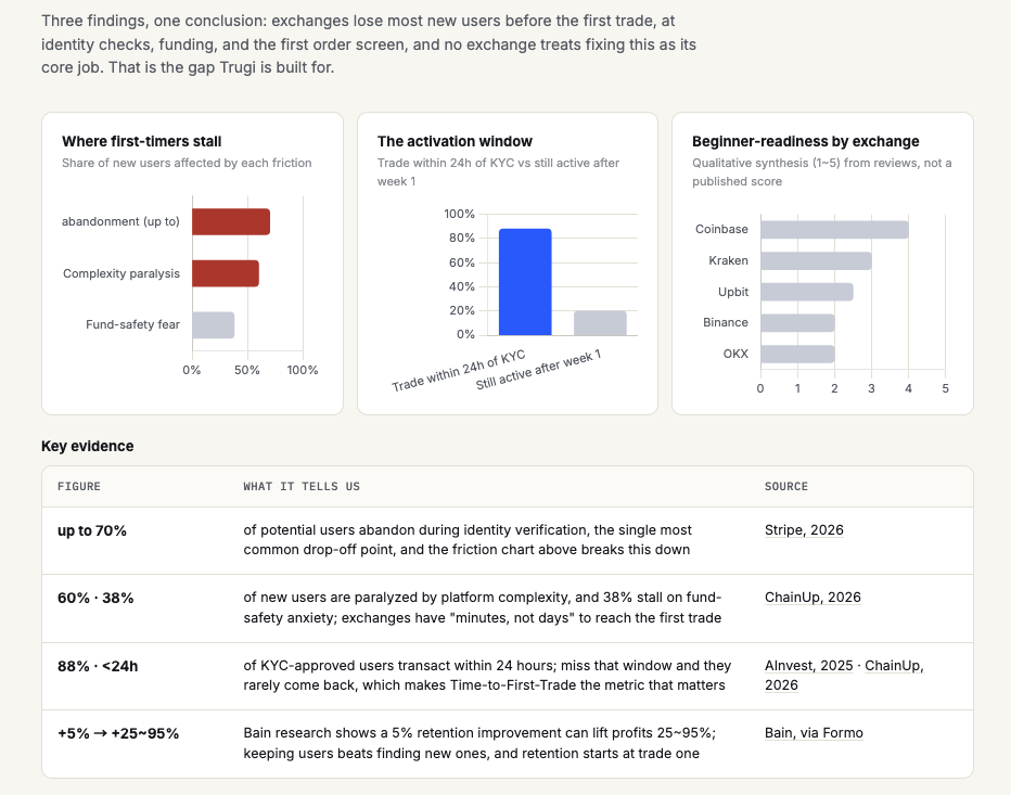
The synthesis board that came out of that process: where first-timers stall, the 24-hour activation window after KYC, a beginner-readiness read across established exchanges, and a key-evidence table where every figure carries its source. The findings below are drawn from this, from web research, with each figure checked against where it came from.
Key findings
- Most exchanges are built for experts, with no obvious on-ramp for a first-timer.
- Beginners who'd already completed KYC on a partner platform still had to repeat it from scratch elsewhere, friction that had nothing to do with trust.
- No existing exchange in the market is designed specifically around a beginner's first fifteen minutes.
- The most repeated pattern in beginner threads wasn't a missing feature. It was uncertainty: not knowing the next step, or whether a mistake could be undone. "One clear step at a time" is the direct answer to this finding.
2.
The Insight
Beginners don't need more features. They need to feel sure about the next step
The research kept surfacing the same pattern: people don't leave an exchange because it lacks power. They leave because they can't tell what to do next, or whether a mistake can be undone. So we designed for momentum, one step at a time. The interface is glassy and light on purpose: it should feel like nothing is hidden, exactly the confidence a beginner needs before moving real money. The amount you enter stays readable whether it's tiny or huge, because a cautious first test deserves to read as confidently as a big trade. Each screen does one job and points to the next, and the whole system leans on a metaphor of growth, so a first trade feels like planting something, not gambling.
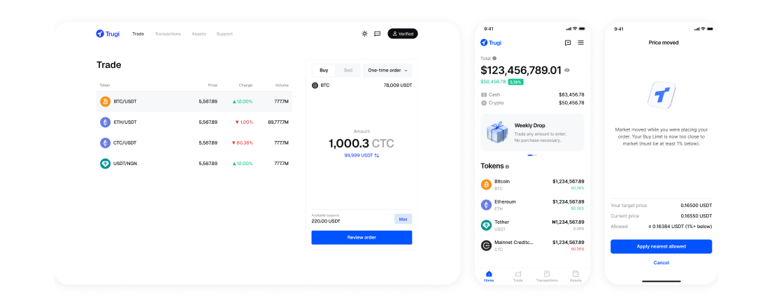
Real screens as shipped: home, the price-moved guard, and the trade screen, where the readable-at-any-size amount is the whole point.
3.
The System
Turning the insight into a shipped flow, and into a system the whole team ships from without me in the room.
3.1 Three Steps to Your First Trade
No jargon. Sign in, choose, confirm, then watch it grow. Three steps, because the flow analysis below showed every other step was either jargon or something smart defaults could absorb.
Sign in
Fast KYC, or skip it if you're already verified elsewhere
Pick what to buy
Choose the asset, plain names
Confirm the trade
See the price, tap once, done
Watch it grow
Track your balance in one calm view
3.2 The User Flow: Competitors vs Trugi
Where competitor exchanges bury a first-timer's trade behind unfamiliar vocabulary and unnecessary choices, Trugi keeps only the decisions that matter, and makes each one feel safe.
What we set out to improve
Remove every step a beginner doesn't need yet. Recognize KYC a user's already completed elsewhere, hide advanced order types behind smart defaults, and never show two decisions on one screen.
What we expect
More first trades completed without help, fewer drop-offs at the confusing steps, and beginners coming back for a second trade.
3.3 Real, Shipped Screens
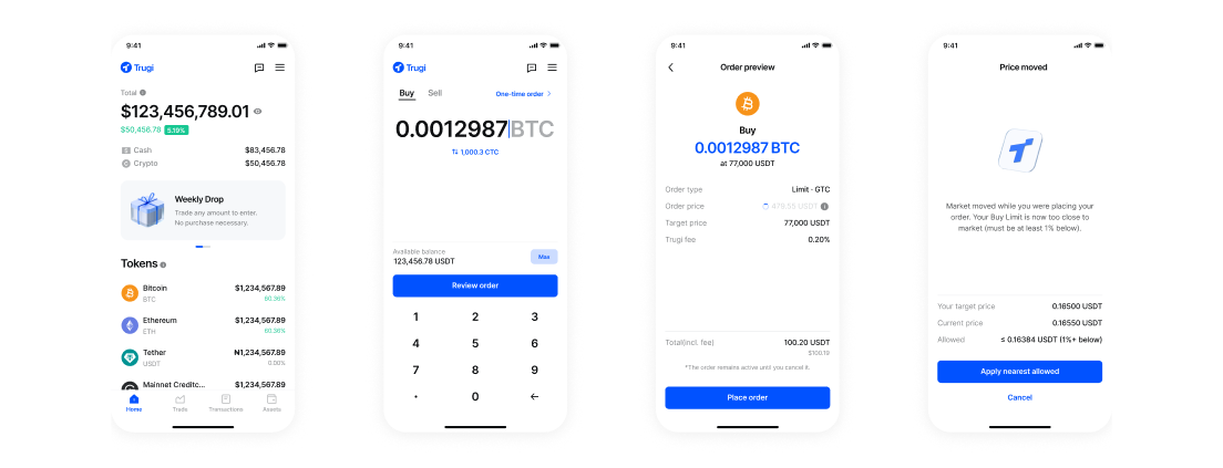
The shipped flow end to end: home, amount entry, order preview, and the price-moved guard.
3.4 The System Is the Handoff
Tokens, components, and states compose into any new screen, so engineers build from the source of truth instead of interpreting mocks. Design QA shifted from "does it match the picture" to "does it use the system," which is a check that scales without me in the room.
The system covers the product's full range: inputs, buttons, list items, token tiles, sheets, and status graphics, all sharing one calm, growth-led language. Anything composes with anything while staying on brand, so new screens ship fast and handoff rework stays near zero across trade, wallet, and settings.
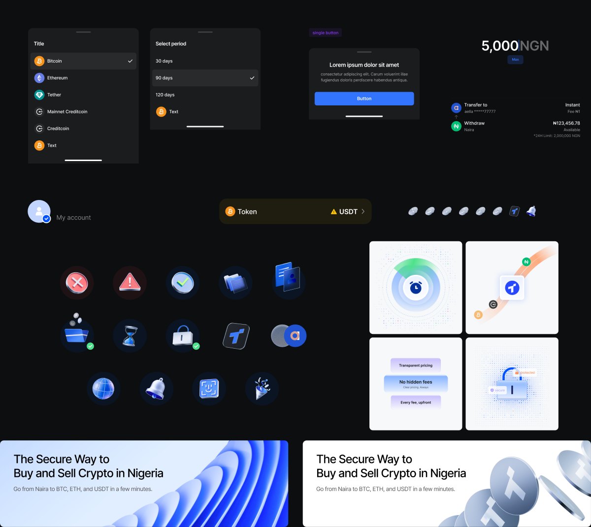
Real components from the shipped system: sheets, list items, token rows, buttons, status icons, and illustration tiles, all composed from the same tokens.
4.
The AI-Native Practice
How this work actually got made, and the operating model I designed so AI multiplies a whole team, not just one designer.
AI was part of how this shipped, not a slide about the future
I ran research synthesis and data analysis with AI assistance, generated first drafts of several graphic assets, and built quick wireframes in Claude Code to A/B test decisions internally. The effect wasn't replacing judgment. It moved my time from production to decisions: what to build, what to cut, and what "safe" should feel like for a first-timer. Once the direction was set, I led the design team that built out the rest of the product in Figma, and the efficiency compounds for everyone downstream of the system, not just for me.
4.1 The Workflow, Before and After AI
Same design rigor, different allocation of time. AI does the compression; people do the judgment. The goal was to eliminate creative friction and operational bottlenecks, not to automate taste.
- Research synthesis takes days of manual affinity mapping
- Two or three concepts explored, because production time is the budget
- Feedback happens on static mocks, so stakeholders react to hypotheticals
- Documentation written after the fact, if at all
- Handoff means redlines, interpretation, and rework
- Synthesis in hours with AI clustering, every theme verified against sources
- Five or six directions explored before converging
- Working prototypes in code by week two, feedback on real behavior
- Documentation produced alongside the work, current by default
- Handoff is the design system itself, engineers build from source
4.2 Case: One Designed System, 39.5 Million Assets Built with Claude Code
Every deposit and withdrawal address in Trugi needs an identity graphic a beginner can recognize at a glance. No team can draw tens of millions of avatars by hand, and random generation breaks recognition. So I designed the visual language, characters, a 16-color palette, split backgrounds, and badges, then built a generator with Claude Code that deterministically maps any on-chain address across Ethereum, Aptos, Sui, Solana, and Bitcoin to one of roughly 39.5 million unique combinations. The same address always gets the same face. The point is recognition, not decoration: when your usual address always looks the same, a wrong one looks wrong before money moves.
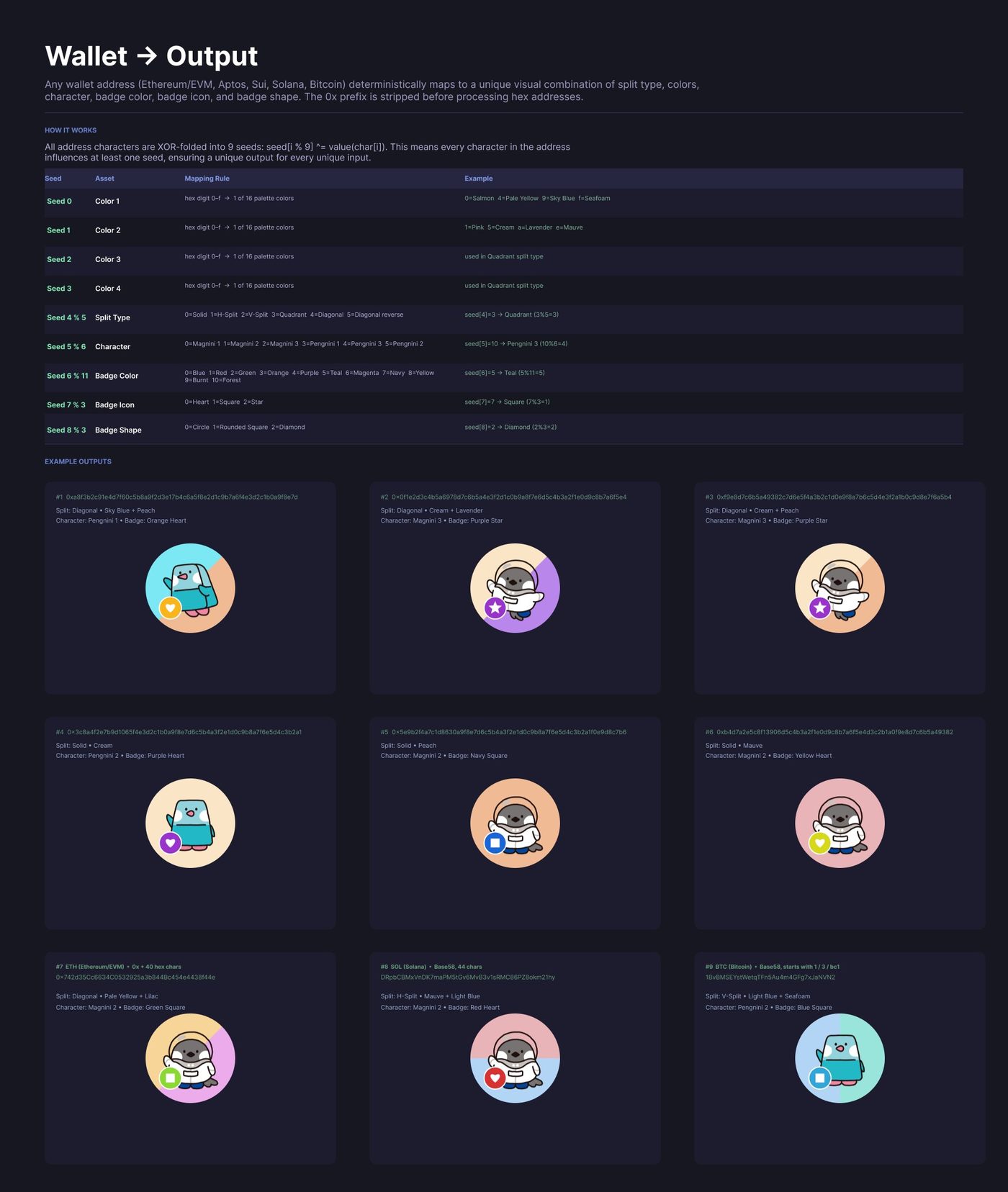
The mapping rules: address characters are XOR-folded into nine seeds that select colors, split type, character, and badge. Every character in the address influences the output.
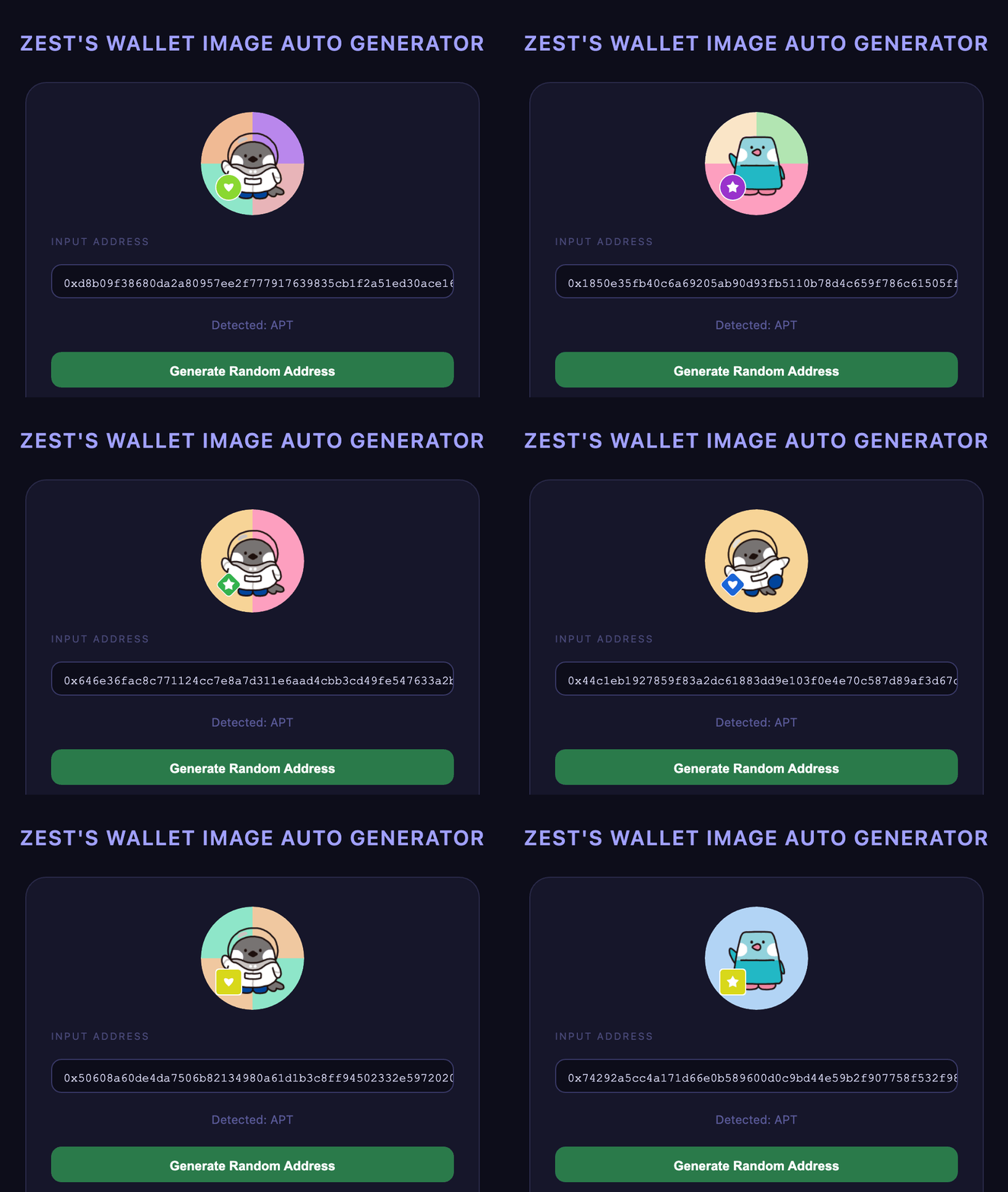

The tool running (left): one address in, one avatar out. And 1,000 of the roughly 39.5 million combinations it produces (right). Designers define the language once; the tool generates every asset on demand, and it is the same self-contained tool I handed to the dev team to wire in.
This is what "AI as a multiplier" means in practice: a designed language plus a small tool covering production work no team could ever do by hand, with every output staying on brand.
4.3 The Operating Model Designed, pending rollout
Operationalizing design AI is an organizational problem, not a tooling one. This is the operating model I designed for it: the rituals and gates that keep human judgment in the loop when the product starts advising users.
Design critique
A weekly checkpoint reviewing estimate accuracy and wording before any consulting surface moves from shadow mode to default-on.
Design-compliance handoff
Every estimate's disclaimer language and confidence framing gets legal and compliance sign-off alongside design, not after. This is financial-adjacent content.
Internal playbook
A short, living doc on how to phrase an estimate versus a risk read versus advice, and how the team should prompt and interact with the internal tools behind them.
Design QA
Human-in-the-loop becomes a testable QA gate: every AI surface must clearly label itself as an estimate or read, never advice, before it ships.
4.4 Where This Goes: Advise, Not Just Execute Proposed, not shipped
Once the mechanics stop being scary, a beginner's next question changes from "how do I trade" to "should I." The one-step-at-a-time system earns trust for a single trade; the next step answers that second question by moving the design system from static components toward intelligent, context-aware patterns: Trugi offering estimates and risk reads grounded in real data, in plain language, without ever executing anything on the user's behalf.
Concept sketch, not built. Illustrative only.
Trugi Consult
ETH is down 3% today, in line with the broader market, not an ETH-specific move. Estimated range over the next 24 hours: $3,140 to $3,220.
Estimate, not advicePortfolio Read
78% of your holdings are in assets that moved more than 10% this week.
This is a read, not a recommendation. Nothing rebalances without you tapping to confirm.
Every estimate is grounded in real data and labeled as an estimate. Nothing here executes a trade. It only informs the decision a person still makes.
Is now a good time to trade ETH for USDC?
Estimated range, next 24 hours: $3,140 to $3,220, based on 30-day volatility.
Estimate, not advice78% of your holdings moved more than 10% this week.
A read, not a recommendation. Nothing rebalances automatically.
View breakdown →
Trend, explained
ETH is down 3% today, in line with the broader market, not an ETH-specific move.
Source: market data feedHuman-in-the-loop by default: every estimate is labeled as an estimate, every risk read is a read. Nothing here executes a trade or rebalances a portfolio on its own.
5.
Impact & Retrospect
What shipped, what it means for the business, and what I'd carry to the next team. Reported honestly.
Every completed first trade is a retained user who didn't bounce to a competitor exchange. For a fee-based exchange, first-trade completion sits close to a leading indicator of revenue. Early sign: five of six first-time testers finished their first trade without asking for help. That was the whole goal, though it's one small qualitative pilot, not a statistically powered result, worth saying plainly.
What we solved
- A beginner can finish their first trade unaided
- The interface stays calm at every step, at any amount size
- Engineers ship from the design system, handoff rework near zero
- The team's time moved from production to decisions
Next iteration
- Test the full trade flow with more first-timers, and instrument the funnel
- Fill in the last empty and error states
- Run the operating model as consulting surfaces roll out
- Add more tokens, chains, and languages
What I learned
- AI widens exploration; it doesn't pick. Budget the saved time for judgment, not more output.
- Prototype in code earlier than feels comfortable. Stakeholder feedback on real behavior is a different, better signal than feedback on pictures.
- Make human-in-the-loop testable. A principle nobody can QA is a poster, not a practice.
- When your users are somewhere you can't be (ours were in Nigeria), AI extends your reach, but verification carries the trust. Distance makes source-checking stricter, not optional.
The goal was never a slicker trade screen. It was to make a beginner's first fifteen minutes feel like planting something, not gambling, and to build a design practice where AI does the compression so people can do the judgment. The product shipped. The practice is what I bring to the next one.