Turning one design system into a tool the whole team can build with
In real cross-functional use: a PM, designer, and frontend engineer build the next iteration from it as one source of truth. A design system is only as good as the outputs it produces, and those depend on who's building. So I took the Trugi design system, fed it into Claude, and used Claude Code to build Idea Builder: a browser-based, on-brand screen builder where a PM, designer, or frontend engineer assembles product screens from governed components, then pulls an exact, on-system spec straight into a ticket. One shared source of truth across the Trugi and Penguin product family, so what ships meets the bar no matter who makes it.
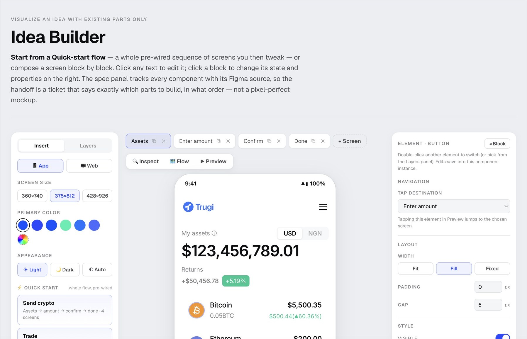
Idea Builder: governed components on the left, a live on-brand screen in the middle, exact properties on the right. Built with Claude Code from the Trugi design system. Deployed internally, improving in use
Problem
The real cost was communication. Every idea traveled the team as a relay, PM to design to engineering to stakeholder, and each handoff meant re-explaining, re-mocking, and re-typing what the last person already knew. The drift across five separate Figma libraries, where no one was sure which was the real source, only made it worse: output depended on who was building, and design sat on the critical path of every feature.
Solution
Encode the system into a tool instead of a document. Idea Builder: every block is already on-brand, every screen exports an exact spec, and one source of truth is shared across PM, design, and frontend.
Practice
Built with Claude Code, seeded from the Trugi design system in Figma. Now in cross-functional use as a shared source of truth for the next product iteration.
Role
- Design-system architecture and governance
- Built Idea Builder, the internal tool, with Claude Code
- Brand, component and pattern design
- Led design, working with a team (PM, design, frontend)
Tools
- Figma, the design system's source of truth
- Claude Code, used to build Idea Builder itself
Process
- The Origin
- The Insight
- The System
- Where This Scales
- Impact & Retrospect
1.
The Origin
A design system that worked for one product, and the gap that showed up the moment it had to work for many.
1.1 From One Product to Many
The Trugi design system did its job for Trugi: tokens, components, patterns, a coherent product. But the Penguin product family had more coming, a wallet, a swap, and others scheduled, and the same question kept surfacing: how do you keep every one of them on-brand and coherent when different people, on different timelines, are building them?
1.2 Where a Written System Leaks
A system captured as a component library plus a guidelines doc still depends on someone reading it correctly and applying it by hand. In practice that means drift between products, specs re-typed at every handoff, and design sitting on the critical path of every single feature, even the ones that use nothing new. All of it is communication cost: the tax a team pays when the system lives in a document instead of in the thing everyone builds with.
The gaps a document couldn't close
- The team had drifted across five separate Figma design-system libraries, so no one was sure which one was the real source.
- Consistency depended on who was building, not on the system itself.
- Design-to-dev handoff meant re-typing values that already existed in the system.
- Design was a per-feature bottleneck, even when a feature introduced nothing new.
Before, three roles (PM, design, front-end) each chased five scattered Figma libraries for the right part. After, everyone builds from one tool on one source. Same input, same output, whoever ships it.
2.
The Insight
If consistency depends on who's building, the system has to live in a tool, not a document
The realization that shaped this: a design system read by humans will always be applied unevenly. A design system built into a tool applies itself. So instead of writing more guidelines, I encoded the system into a builder, every available block already on-brand, every screen able to emit its own exact spec. The bar moves from "did they follow the system" to "the system is the only material there is to build with."
That reframes the design role too. When the tool guarantees the output, design stops drawing every screen and starts running the system that lets others produce correctly. The designer's judgment moves to where it matters most, confirming at QA and making the system richer, instead of re-checking padding on every ticket.
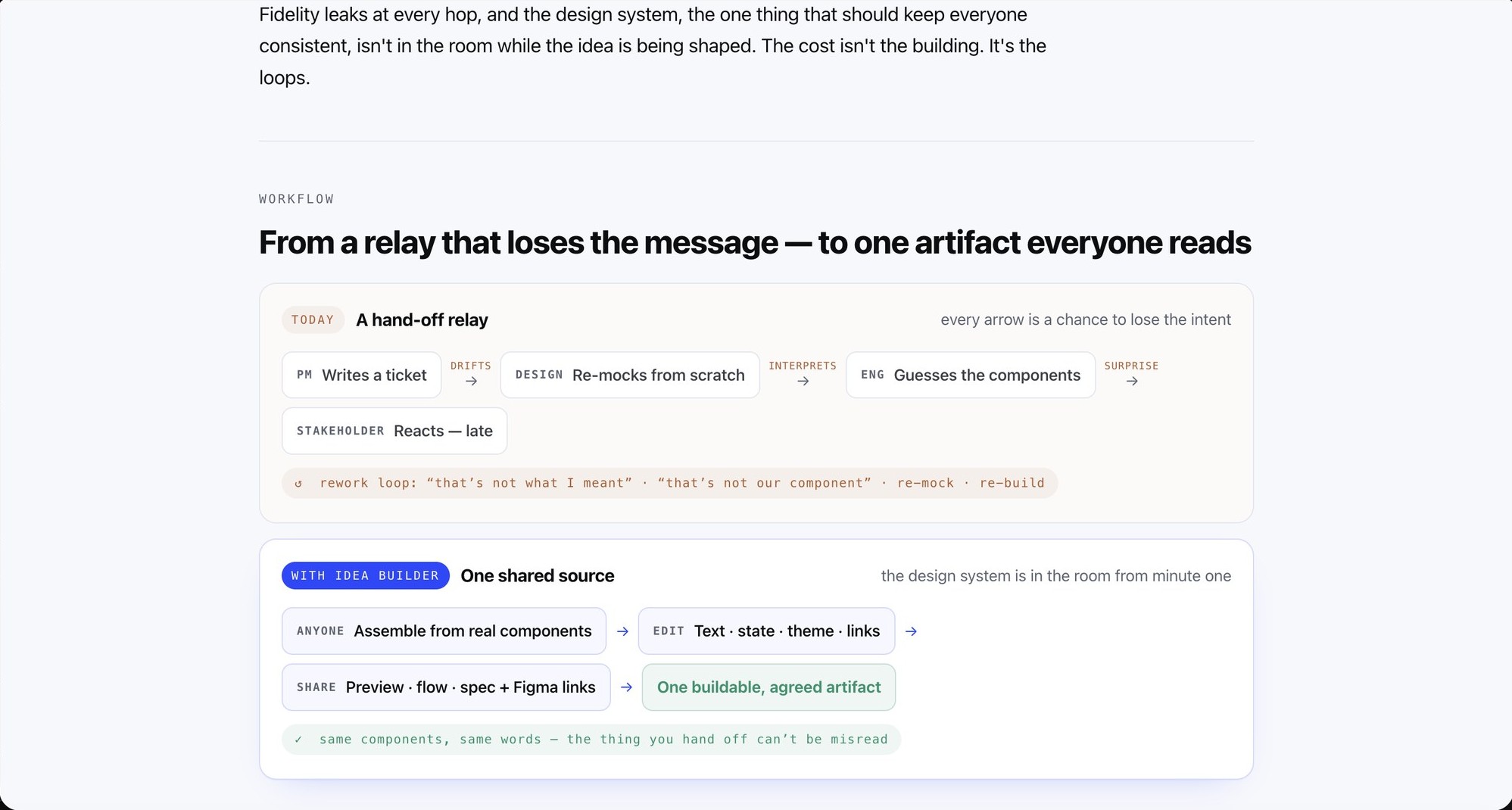
From the internal case I built for the tool: today an idea travels as a hand-off relay, PM to design to engineer to stakeholder, and every arrow is a chance to lose the intent. One shared, real-component artifact collapses the relay into something everyone reads the same way.
3.
The System
Idea Builder: one internal tool, built with Claude Code, that turns the design system into something a whole team can build with.
3.1 See It Work
3.2 Built with Claude Code, and How to Prompt It Operationalized with AI
The tool itself is the AI story. I fed the Trugi design system's Figma into Claude and built Idea Builder with Claude Code: the component library, the theming, the flow wiring, the spec export. This isn't AI generating throwaway UI. It's AI used to turn a design system into durable internal infrastructure the team builds on, the difference between using AI to make an artifact and using it to make a multiplier.
And that infrastructure isn't frozen. Components can be added, changed, or removed inside the builder itself, so when the product line expands and needs a part that doesn't exist yet, you draft and validate the new component here, in a real screen and in context, before committing to build it from scratch. The cheap exploration comes first: prove the UX on-system, then formalize only what earns its place, with the designer still deciding what becomes canonical.
Idea Builder wasn't generated in one shot. It was built as a repeatable method, one another designer on the team can rerun. The short version:
- Seed from the real design system, not a blank page, so the tool can only produce on-system screens.
- Build the governed component library first, one family at a time, each reviewed against Figma.
- Add theming (light/dark, primary color, device sizes) as global constraints, not options.
- Wire whole flows with tap destinations, walkable before a line of production code.
- Make the handoff a buildable spec, developed in conversation with the front-end markup team so it matched what they actually needed.
See the full playbook
Why it exists
The team had drifted across five separate Figma design-system libraries, and no one was sure which was the real source of truth. Idea Builder was built to end that: one place where the actual source lives, and where anyone can create and ideate on it instantly.
1. Seed from the source of truth, not a blank page
I gave Claude Code the design system as ground truth, so the tool could only produce screens that obey it: tokens, spacing, type, and the component set.
Prompt in spirit: "Here is our design system. Build a component library that can only produce on-system screens. Nothing off-system."
2. Build the library before the builder
I generated the governed blocks one family at a time (buttons, lists, headers, toasts), each with its real variants and states, and reviewed each against Figma before moving on.
"Generate the Button with its 6 variants and states from these tokens. Do not invent styles."
3. Theming as constraints, not options
Light, dark, and auto appearance, a primary-color control, and three device sizes became global controls that re-theme every block at once, so one base serves the whole product family.
4. Wire flows, not just screens
Screens chain into flows with tap destinations, so a Quick-start like Send crypto is walkable before any production code.
5. Make the handoff a buildable spec, with the people who build
Every element exposes its exact CSS on inspect, and a screen exports a spec for a ticket with components linked back to their Figma nodes. I developed this in conversation with the front-end markup team throughout, to be sure the output matched their real needs and was useful to everyone, not only designers.
6. Govern by growth, and keep it lean
New parts a real screen needs become candidate components, so the library grows from shipping. Rarely-used graphics stay out on purpose, since they need manual work case by case; if one turns out to be used more than expected, it gets brought into the tool. I keep the judgment on what becomes canonical; the tool keeps the consistency.
The reusable principle
Operationalize AI against a constraint (the design system), review each module in the loop, involve the people who ship, and make the output a buildable contract. That is how one designer turns a system into infrastructure a whole team runs on.
4.
Where This Scales Roadmap, adoption early
Built for the Penguin product line, and deliberately honest about what it is and isn't.
The system seeds the Penguin brand products scheduled next: the wallet, swap (partially on it today), and more to come, each a theme of one base rather than a redesign from scratch. SpaceRouter is deliberately kept out. Space runs its own guideline and system, and forcing one system across two genuinely different brands would break both; knowing where that boundary sits is part of the design, not a gap in it. And because the team builds the next iteration inside the tool, the system grows from use: every real screen that needs a new part becomes a candidate component, so the library gets richer from shipping instead of from a spec written up front. Rarely-used graphics stay out of the tool on purpose, since they need manual work case by case; if one turns out to be used more than expected, it gets brought in.
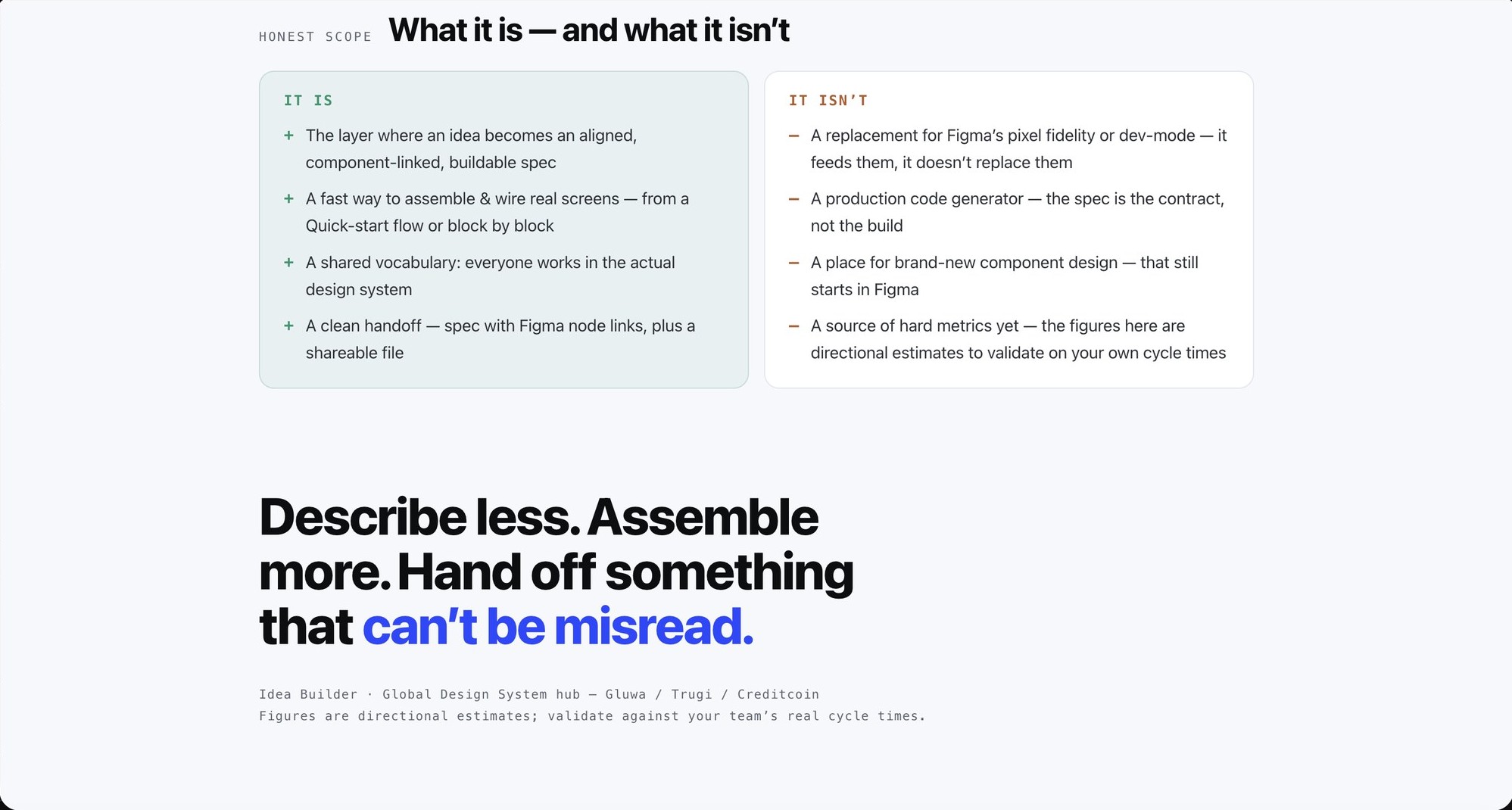
Honest scope, stated plainly in the tool's own case: what Idea Builder is (an aligned, component-linked, buildable spec), and what it isn't (not a Figma replacement, not a code generator, and not a source of hard metrics yet, the figures are directional estimates to validate on real cycle times).
5.
Impact & Retrospect
In cross-functional use for the next iteration, not yet a proven org-wide result.
Right now this is a working tool in a real but early role: a shared source of truth that a PM, a designer, and a frontend engineer are using together to build the next product iteration and, in the process, to make the system richer and hand off faster. It hasn't run long enough for me to claim a velocity number I'd stand behind, so I won't. What I can say is what it changes structurally: the output no longer depends on who's building, and the values a developer needs come out of the system instead of being re-measured by hand.
And when the conversation turns to what that efficiency is worth, I don't ask anyone to take it on faith. I built a working calculator that models the case: team mix, delivery pace, and blended cost in, estimated time and cost reclaimed out.
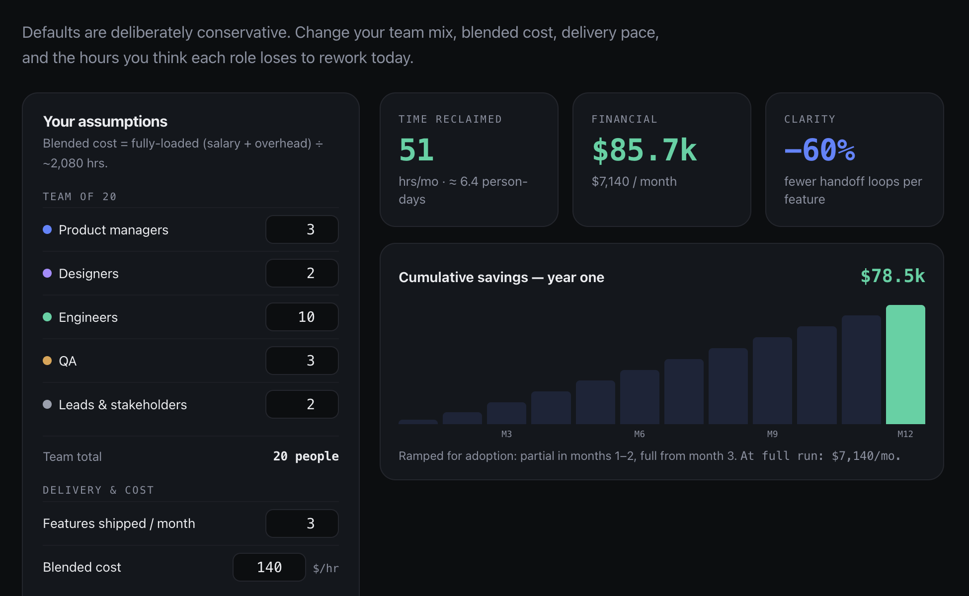
The efficiency model, with deliberately conservative defaults and every assumption adjustable. It claims no measured result; it exists so the value conversation runs on numbers anyone can challenge, the language budget-holders decide in.
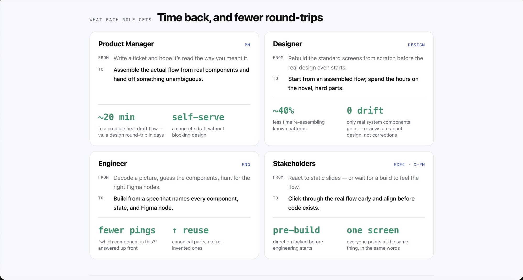
What each role gets, from the internal case: PM, design, engineering, and stakeholders each trade a lossy hand-off for one shared artifact. The figures (about 20 minutes to a first-draft flow, roughly 40% less re-assembly) are directional estimates to validate against a team's real cycle times, not measured results.
What I learned
- A system humans read gets applied unevenly; a system built into a tool applies itself. If you want consistency to scale past yourself, ship the system as tooling, not a PDF.
- Use AI to build infrastructure, not just artifacts. The leverage here wasn't AI drawing screens, it was Claude Code turning a design system into a builder the whole team runs on.
- Deciding what not to include is design work too. SpaceRouter stayed out of this system on purpose, forcing one system onto two very different brands would have broken both, and where a number was an estimate we said so instead of dressing it up as a result. Drawing those boundaries took as much judgment as building the tool.
The goal was never a tidier component library. It was to make the design system the easiest way to build, so that what ships is on-brand by default, whoever builds it.