Turning an easily, safely captured digital twin into a tool you can actually put to use
Shipped: fast, safe remote site inspection and monitoring that replaces the hassle of visiting in person every time. Beamo turns any site into a digital twin: captured on an iPhone, stitched and generated in minutes, explored remotely from anywhere. I redesigned the workflow and navigation around field operators' daily routines and working conditions, and designed and built capture hardware that's safe and compliant with site rules, field-tested and demoed to positive reviews, and delivered. On top of that, I proposed a physical-AI-powered UX through a working proof-of-concept, charting a path toward people and AI making faster, more grounded decisions together.
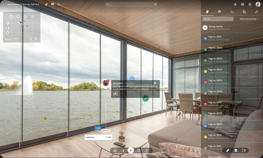
A Beamo twin: captured in one walk-through, generated in minutes, explored from anywhere.
Problem
Field operators log into Beamo to see specific data: a meter reading, a document, a crack photo, a work-progress status. But the existing interface made them click through a long journey to get there, and the data itself had to be checked one by one. That's why a five-second check took five minutes.
Solution
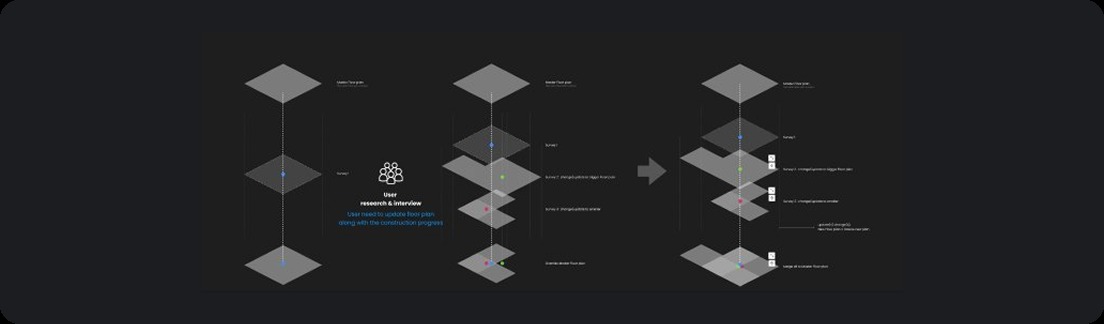
Observed field operators, then rebuilt the IA and navigation around their actual behavior: the files, readings, and hot spots they reach for most surfaced up front and reachable in a few clicks, surveys made comparable side by side to track progress over time, and content creation trimmed down to minimal so it no longer interrupts field monitoring.
Practice
Field research watched what people did, not what they said. Hardware-linked interactions were prototyped in Figma and ProtoPie, the only viable tools for it at the time, and I built a proof-of-concept iOS app for robot capture to test the furthest version of the bet.
Role
- UX strategy, field and user research
- End-to-end prototyping and UI design
- Hardware UX and industrial-design direction
- Design system and art direction
- Prototyped hardware-linked interactions in Figma and ProtoPie, the only viable tools for this at the time
Tools
- Figma, design and system source of truth
- ProtoPie, hardware-linked interaction prototypes
- iOS proof of concept for scheduling and monitoring robot capture runs
Process
- Research
- The Insight
- The System
- The Physical-AI Bet
- Impact & Retrospect
1.
Research
Field research on how people actually use a twin, and calibrating Beamo's direction among real-estate and other spatial-capture platforms, domestic and international.
1.1 Competitive Landscape
Matterport popularized digital-twin capture but optimizes for real-estate walkthroughs, not industrial inspection. It doesn't solve for hands-free capture on hazardous sites, or for surfacing operational hot spots. Beamo's edge: a field-first capture device, and navigation rebuilt around investigation rather than browsing.
1.2 Two Ways to Know What a Remote Space Looks Like
Fly someone out to walk it, or open it on your screen and walk it with the team anytime. Beamo exists to make the second one real, starting with capture simple enough for anyone.
Mark where you're standing on the floor plan, then just walk. Beamo stitches, aligns, and places everything for you.
1.3 How the Research Ran
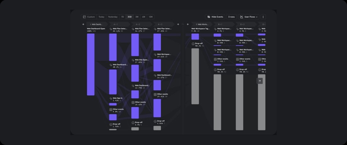
We watched what people actually did in the twin instead of asking what they wanted. The pattern was unmistakable: they retrace the same few routes and reopen the same data, again and again. That observation, not a feature request, is what the navigation rebuild stands on.
Key findings
- People open a twin to find something specific: a meter reading, a document, last month's photo of a crack. Not to admire the space.
- Users retrace the same few routes and reopen the same data repeatedly; the twin is a lookup tool in practice, not a tour.
- Every reading or file required traveling to its exact spot in the scene first: a five-second lookup was a five-minute hunt.
- Capture has its own user: the device is carried for hours by non-photographers, often on sites with real safety constraints.
2.
The Insight
People come to a twin to find something, not to admire it
The insight that shaped everything: people open a digital twin to reach specific data, not to experience the space. The twin was beautiful to walk through and slow to get anything out of, because the interface treated every visit as a tour when most visits were a lookup. So the rebuild optimized for the lookup: get to the thing, see it in context, act on it.
Gorgeous as a scene. But every answer lived somewhere inside it, behind a walk.
3.
The System
Navigation rebuilt around observed behavior, and capture hardware designed for the person who carries it.
3.1 Setting the Starting Coordinate
The first captured point is the one every other capture aligns against to complete the finished twin. Get it wrong and the whole model drifts. The original flow asked people to tap a pin onto a static map: one imprecise gesture for the most consequence-heavy step in the whole capture. I redesigned it so the person's position stays fixed at the center of the screen, and the floor plan underneath is what moves: pan and pinch-zoom the map until the position circle lines up with where you're actually standing, confirmed by a live distance readout before locking it in.
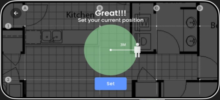
Position stays centered. The floor plan moves underneath until the circle and the live distance readout confirm the fix, then Set locks it in.
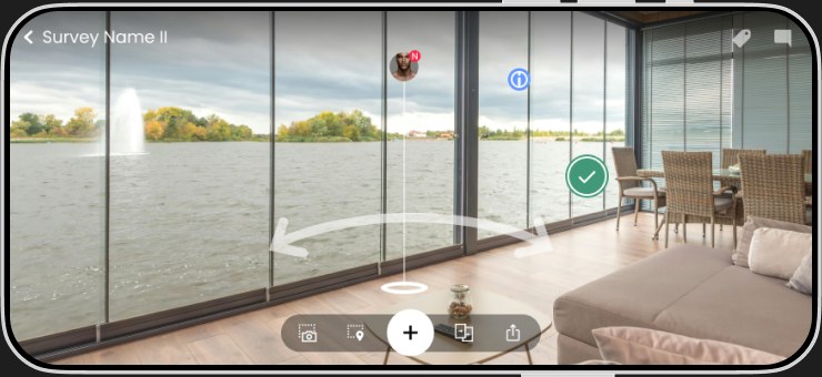
That anchor is what every capture afterward aligns against, all the way through the walk-through.
3.2 Surface What People Reach For
Every reading or file used to mean traveling to its exact spot first. The rebuild surfaces destinations up front and makes surveys comparable, so the twin answers before it asks you to walk.
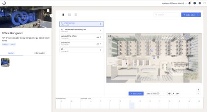
Plan list and surveys aren't viewable: no detail info, and no way to compare.
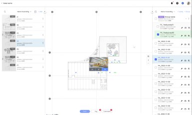
Comparison across multiple surveys, with previews that give a clear destination before you jump.
3.3 Create Without Blocking the Scene
Field notes belong on the spot they describe. Creation moved from a panel that covered the scene to a click on the location itself.
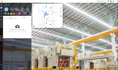
To create content, a left panel opens and covers the very scene you're annotating.
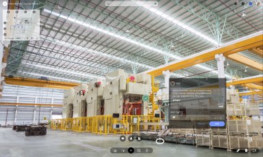
Create content on the scene by clicking the location. Nothing blocks the view.
3.4 Hardware: Designed for the Person Carrying It
From research and ideation through prototyping to production. The capture device gets carried for hours by people who aren't photographers, so comfort and simplicity are features, not polish. Hardware-linked interactions were prototyped in Figma and ProtoPie, the only viable tools for this at the time.

What we expect
A first-timer captures a full site with no training, respecting safety guidelines and the actual environment: lightweight, with nothing blocking the visuals, so long capture sessions stay comfortable.
4.
The Physical-AI Bet
The whole point was fewer trips and lower risk. The furthest version of that removes the person from routine capture entirely, and keeps humans exactly where they matter.
4.1 From a Person Walking the Site to a Robot That Never Has to Stop Concept, with a working PoC
The furthest version of "fewer trips" isn't a better viewer for a person to use. It's removing the person from routine capture entirely. A mobile robot can walk the same routes daily, in conditions no inspector should have to, and feed straight into the same digital twin pipeline Beamo already had. I prototyped this directly: a proof-of-concept iOS app for scheduling and monitoring autonomous capture runs on Boston Dynamics' Spot, built specifically for this case study.
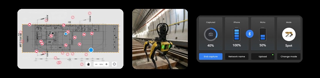
Left to right: the scheduled capture route on the floor plan, Spot carrying the rig where no inspector should have to walk, and the PoC app monitoring a live run: capture progress, device batteries, and mode.
Spot walks the scheduled route around the clock. The app lets a human review what it captured, confirm flagged anomalies, and approve the next route, never walking the hazard themselves.
This is the kind of forward-structuring that's easy to skip under deadline pressure, but it's the difference between a digital twin that depends on a person showing up, and one that doesn't.
4.2 AI-Native Patterns Proposed, not shipped
Three pattern types extend the same navigation rebuild into autonomous, human-in-the-loop analytics: a twin that flags, answers, and guides capture.
New crack near Riser Room, 3F. Not present in last month's capture.
Flagged automatically during capture sync.
View comparison →
"Where's the exposed wiring?" → jumps to Panel 4B
82% confidence, one matching location found.
Live capture guidance
62% of this floor covered. Slow down near the stairwell, overlap is getting thin.
On-device, real-timeHuman-in-the-loop by default: every alert ships with its evidence, every AI answer with a confidence score and a real jump-to-location. Never a silent auto-fix on a live site.
4.3 The Operating Model Designed, pending rollout
These patterns are proposed, not shipped, so there's no usage data to report yet. This is the rollout plan: how design, hardware, and field ops would operationalize human-in-the-loop AI inside the existing workflow, not just the UI.
Design critique
A weekly checkpoint reviewing false-positive and false-negative visual-anomaly flags before any pattern moves from shadow mode to default-on.
Design-hardware handoff
Capture-guidance thresholds (overlap percentage, pacing) become part of the firmware and UI spec together. Field ops signs off alongside design, not after.
Internal playbook
A short, living doc on how the twin should word a grounded answer versus say "not confident, here's the closest match," kept next to the design system docs.
Design QA
Human-in-the-loop becomes a testable QA gate: every AI answer must show its jump-to-location and confidence before it ships, the same way accessibility checks gate a release today.
5.
Impact & Retrospect
What I changed, what came of it, and what to expect next.
- Context
- People opened the twin to reach specific data: a reading, a document, a photo. Not to admire the space. Getting to that one thing meant navigating the whole scene, turning a five-second lookup into a five-minute hunt.
- Intervention
- Rebuilt navigation around what people actually do: retrace the same few routes and reopen the same data again and again. Files, readings, and hot spots are now surfaced up front, comparison between surveys is built in, and content creation no longer blocks the scene.
- Evidence
- Direct: teams that used to fly in and out for inspection can now walk the site remotely, anytime. Indirect and shared: this contributed to lower travel and logistics spend and fewer on-site incidents, alongside broader operational and insurance factors I wasn't solely responsible for. I'm not claiming the full cost reduction as a design-only outcome.
- Business value
- Fewer trips means lower travel and logistics spend, fewer chances for something to go wrong on-site, and a navigation pattern reusable across every future capture: the main lever for the AI-native patterns proposed above.
- In business terms
- Fewer flown-in inspection trips is a direct travel and logistics cost reduction; fewer on-site incidents is a direct insurance and risk cost reduction. Both are levers a facilities or EHS budget owner cares about, even though I can't attach a verified dollar figure to either yet.
- What's next
- The visual-anomaly, ask-the-twin, and capture-guidance patterns above are proposed, not shipped. Before rollout, I'd want a real before-and-after on lookup time for a specific reading, with an actual baseline, not a retrofitted number.
What I learned
- Watch what people do, not what they say. The rebuild stands on observed routes and reopened data, not on a feature request.
- When software rides on hardware, the person carrying the device is your first user. Comfort over hours is a feature, not polish.
The goal was never a prettier walkthrough. It was to change the math: fewer trips, lower risk, and a system that gets someone to the exact answer, whether it comes from a person walking the scene or a model pointing at it.